

Media and Text
Sometimes when building out a page we don't want our content to all be displayed in a single column from top of page to bottom of page. In those cases it's nice to introduce a two column block with a media element such as a video or an image. Media and Text set let's us do this.
The Media and Text block is a two column block that gives us the flexibility and customization we need to feature images or video on our page with an adjacent description. Let's take a look at the core pieces of this set.
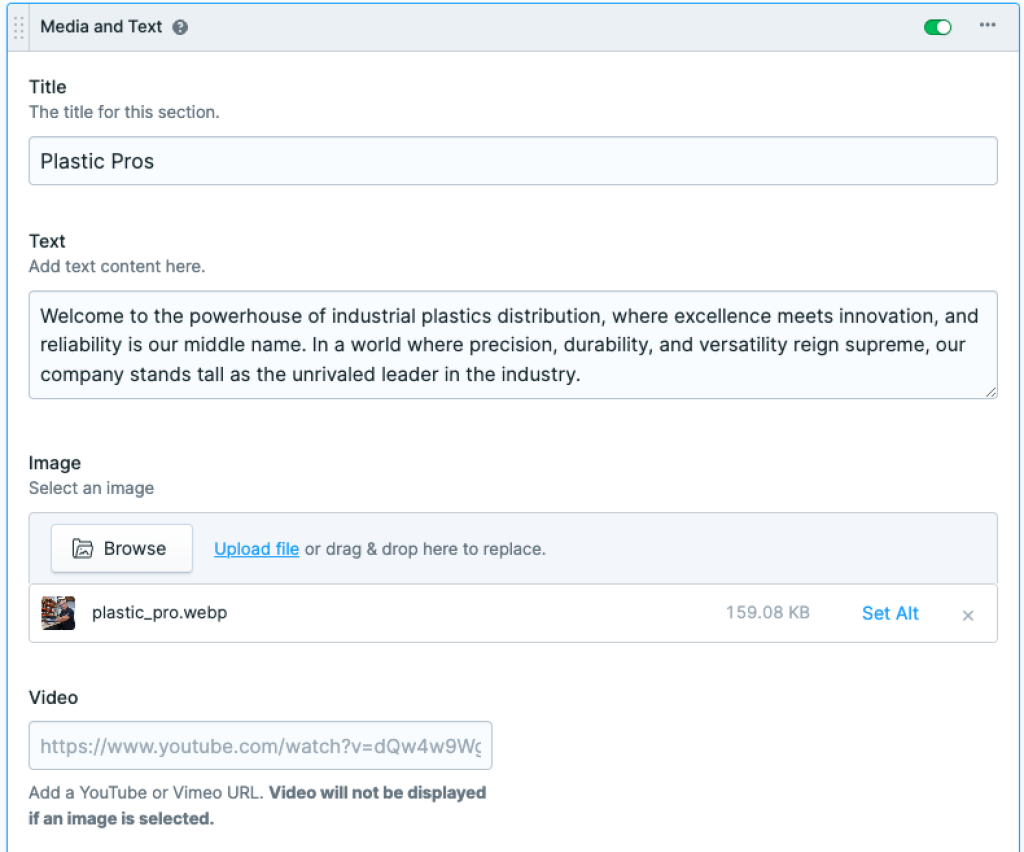
The bread and butter of this set begins with a Title, Description, and an Image or Video. Note if adding a video url to the Video field, the Image field should be left empty. To further customize this set and add some flair we can change a few settings.
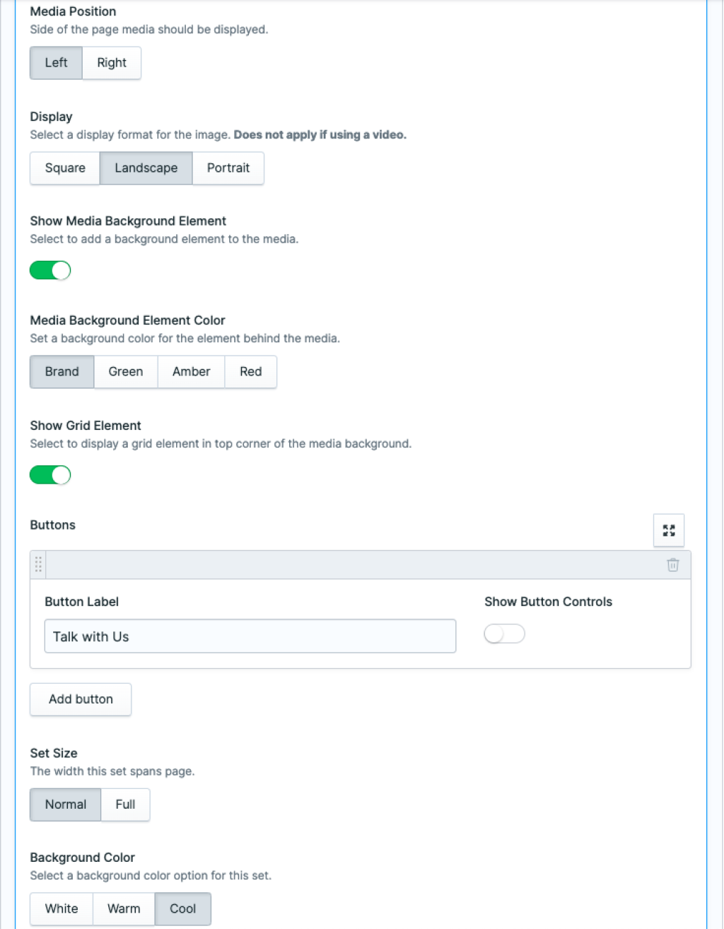
The following fields give us the flexibility to change image orientation, display position, element colors, and options for setting a call to action. Consider the following available fields:
Media Position - We can set our media (video or image) to be displayed on the right or left sides of our block.
Display - Optionally we can select the orientation of our image, context is important here usually this is determined by original image ratio or text content adjacent in the opposite column.
Show Media Background Element - This displays a nice accent piece behind our image to give the media area a more complete look. It also reveals the Media Background Element Color option buttons.
Media Background Element Color - When selecting a background color here it changes the background color behind the media element.
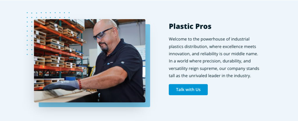
Show Grid Element - Flipping this toggle on, displays a nice preconfigured element in the upper corner of our media element, a grid of blue dots (reference in the example image at the beginning of this article).
Buttons - Optionally we can add a button as a call to action by adding some text to the Button Label field and selecting Show button Controls to reveal button linking options. We can link to an Entry, URL, Email, Telephone, SMS or Asset.
Set Size - We can let this set take up the complete span of the page by setting it to Full or set it to Normal for some margin on both sides.
Background Color - The background color for this section is specified here. White is set by default.
With some thought, a nice graphic or an awesome video this set can bring a page to life. It's often a good idea to spend sometime flipping toggles, pressing various buttons, and trying different color styles to get the result we want. Happy creating!