

Link Blocks
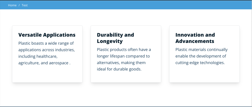
How we display chunks of content on a page matters because it helps users scan the page and locate the information that best resonates with them. Using the Link Blocks allows us to break down content into digestible bits in a card format.
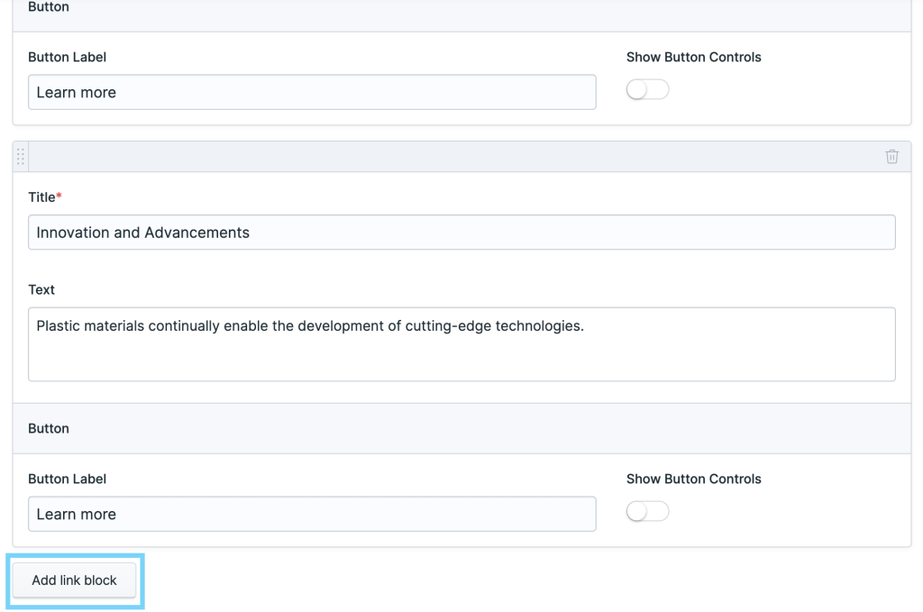
To get started with the link blocks, select it from the Page Builder set options and begin by entering a title for the link block section (optional, and left blank in this example). There are three main parts to the link block item Title, Text, and Button. Title and Text are required but a call to action button is optional. A button is automatically added when you begin typing in the Button Label field. Selecting the Show Button Controls gives us the option to link an Entry, URL, E-mail, Telephone, SMS, or Asset to the call to action button.
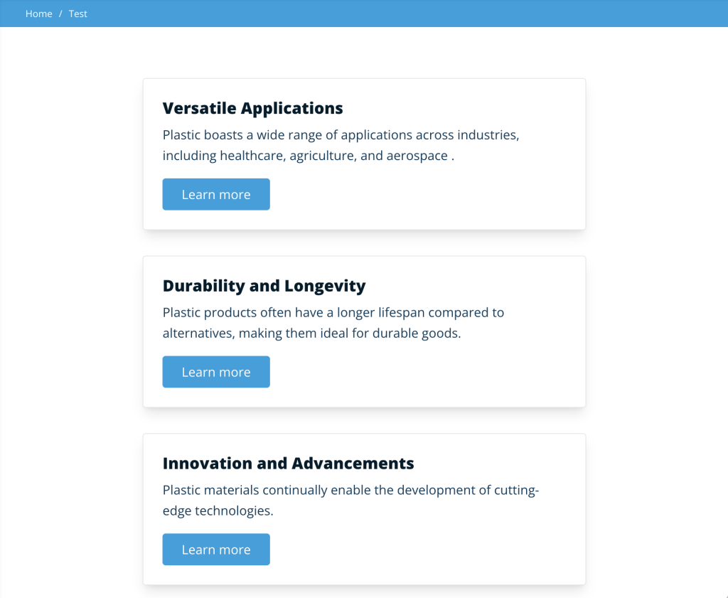
To add additional link blocks simply click Add link block. The grid pattern is automatically handled to set a row of 3 items. Keep mind if setting 5 link blocks there will be an empty spot on the bottom right of the grid. For medium to smaller windows the cards stack neatly in a single column.
The thoughtful arrangement of content on a webpage greatly influences user experience, allowing them to efficiently navigate and find relevant information. Utilizing Link Blocks facilitates this process by breaking down content into manageable sections presented in a visually appealing card format. With easy customization options and the ability to add multiple blocks seamlessly, Link Blocks provide a user-friendly solution for organizing and presenting content effectively on webpages of any size.