

Grid Cards
Cards are essential elements we can use on our webpage to better disperse content into more digestible reading for users. There are various use cases for the Grid Cards, most commonly the cards are used as an informational buttons. The card holds top level content and often links to another page on our website.
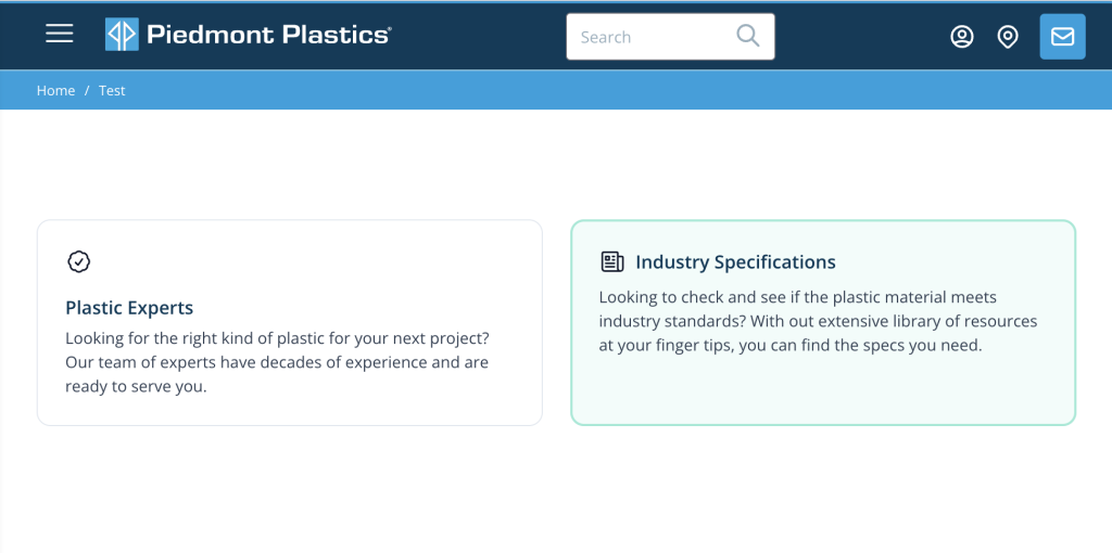
As it's name implies the Grid Cards are displayed in a two column grid. For optimal display it's recommended to use these cards in sets of two. Let's make some cards like the example above.
Once Grid Cards has been added to the Page Builder set, begin by selecting the round + icon to add your first card. Once added you will notice the following fields:
Title
Description
Link Resource
Show Icon
Theme Color
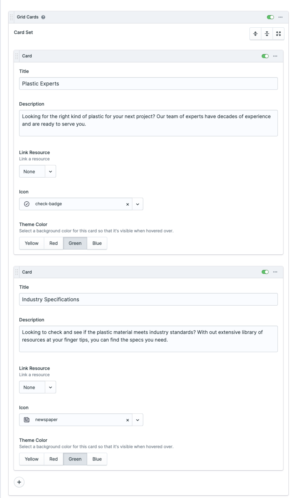
The Title and Description fields are the bread and butter of this card. Simply we can add that and stop there and move on to the next card. But if you need to link it to an entry or a url that's also an option. I like my blocks to have some style and icons are a nice way to spice things up. Select the Show Fields button under the Icon field to add an icon to the top left corner of the card.
Finally select a theme color that best fits the content of the card or the contextual theme of the page.
To add another card select the round + icon on the bottom right corner inside of the Grid Cards set.
And there you have it - a nice set of Grid Cards to break up the content on your page while boosting user engagement and interactivity.
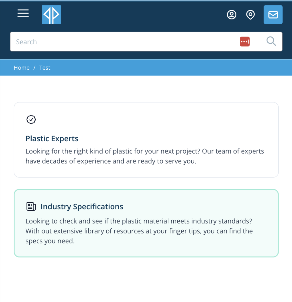
Grid Cards offer a visually appealing way to disperse content on webpages, presented in a two-column grid layout. Users can easily digest information with titles, descriptions, and optional links, while customizable theme colors and icons enhance engagement and interactivity.