

Flip Card
Sometimes web pages can be a little boring and when there's little to no interactivity users can find the web page less engaging. With the flip card block users can hover over a card and it will spin around to the other side showing more information and a call to action.


The Flip Card block is essentially a replicator block that allows for a minimum of 2 to 4 cards. Let's dive into the blueprint to see how the content is added.
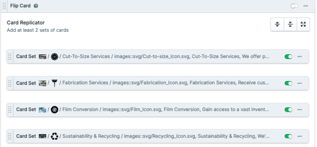
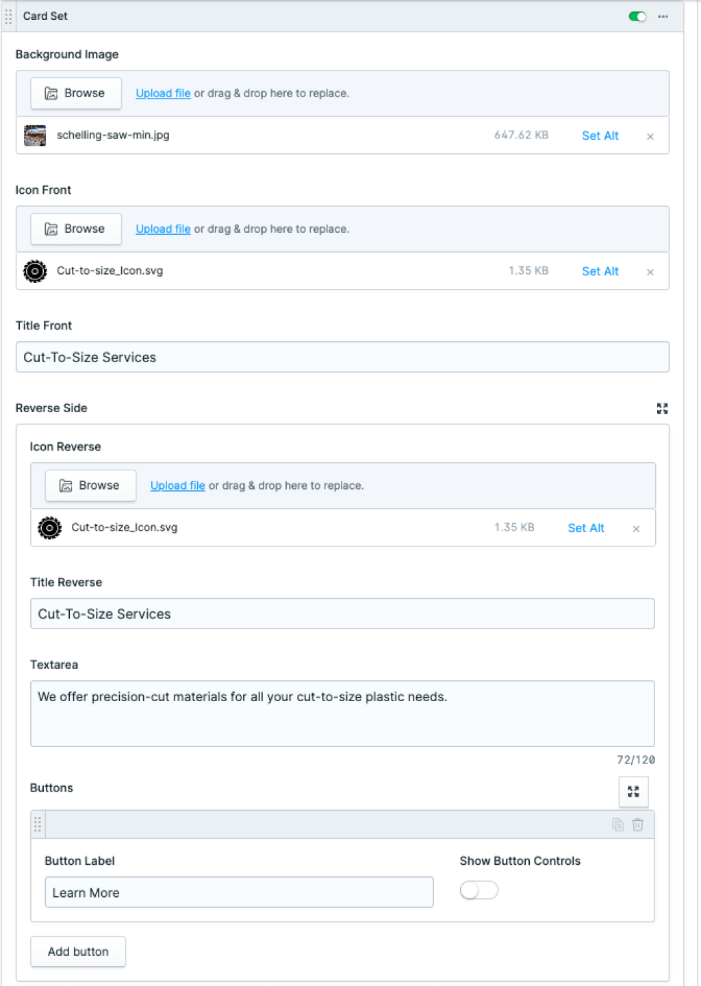
The simplest way to think about these cards and the content is by remembering there are front and reverse sides to the card. Here are some of the following parts to think about:
Front background image
Front icon
Front title
Reverse side
Reverse icon
Reverse title
Textarea
Call to action button
It might help to study the first two images in this article, by looking at the second image, you may notice the layout includes a few pieces that differ from the front.
To make a Flip Card, select the plus icon on the bottom left and upload a background and icon image, and add a title. For the reverse side upload an icon, add a title, and some subtext. Add a label to the Buttons field in the Button Label field and select the Show More Controls toggle to link the button to an internal entry or a custom URL.
If additional cards need to be added, click the plus icon in the bottom left corner and repeat the steps above.