

Content Plus Media
When structured correctly, graphics and typography make a modern web design come to life. Having the flexibility to add/remove blocks of text and swap images out for a video are all handy ways to make our webpages look better.
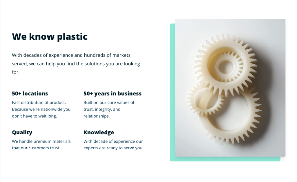
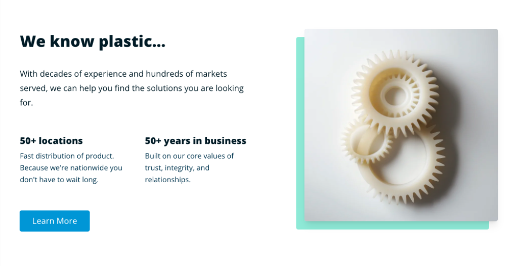
The Content Plus Media block gives us a lot of flexibility and there are several configurations we can use to make our page look awesome. Considering the layout of the graphic above, let's take a look under the hood to see how it was configured.
First consider the fields we're using here:
Content - The content field is where we can include our title and description for this block. We use markdown to set a title with an H2 tag (## symbols before text) and normal text for the description or "subheading." Click on the Markdown Cheatsheet if you're not sure what to do.
Image - In this example we selected an image from our assets directory.
Media Position - Specifies on which side of our two column block we want the media to be placed.
Image Size - Depending on the length of the content on the opposite side of our image it's best practice to select an image orientation that fits best.
Image Background Element Colors - Behind our image is a nice green element, this field gives us a few color options to choose from like Brand, Green, Amber, and Red.
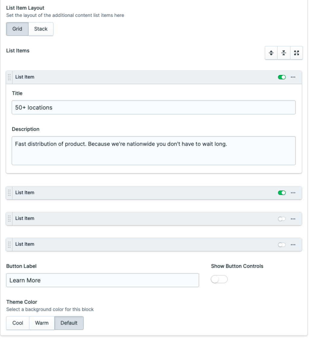
List Item Layout - Selecting a layout for our list items requires some foresight into how we plan to use our list items. The list items are configured for a grid of two columns across. So when adding 3 items it may be a good idea to select the Stack option as opposed to the Grid option. In our example we selected the Grid option.
List Items - A replicator field that holds a list item or multiple list items. By selecting the round + icon, list items can be added here.
List Item - An item that contains a title and description field. These fall under our main Title and Description area. In our example we have 50+ locations as our title and Fast distribution of product... as our description. We can add up to 4 list items.
Theme Color - The theme color sets the background color for the entire section. For this example I only selected Default.
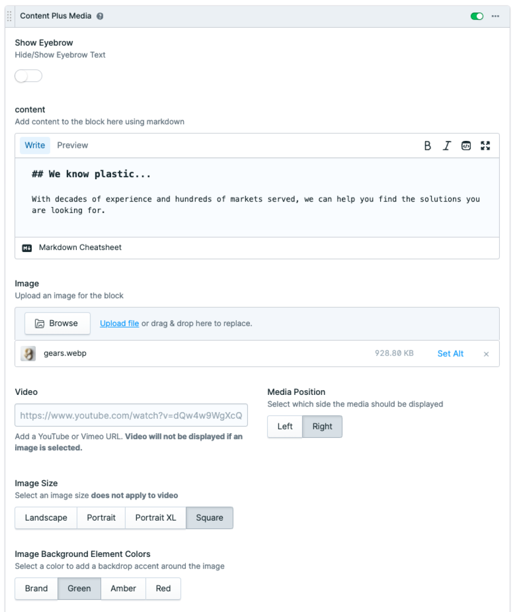
Some of the other fields we did not use in the first example:
Show Eyebrow - Adds a nice element of handwritten looking text above the title.
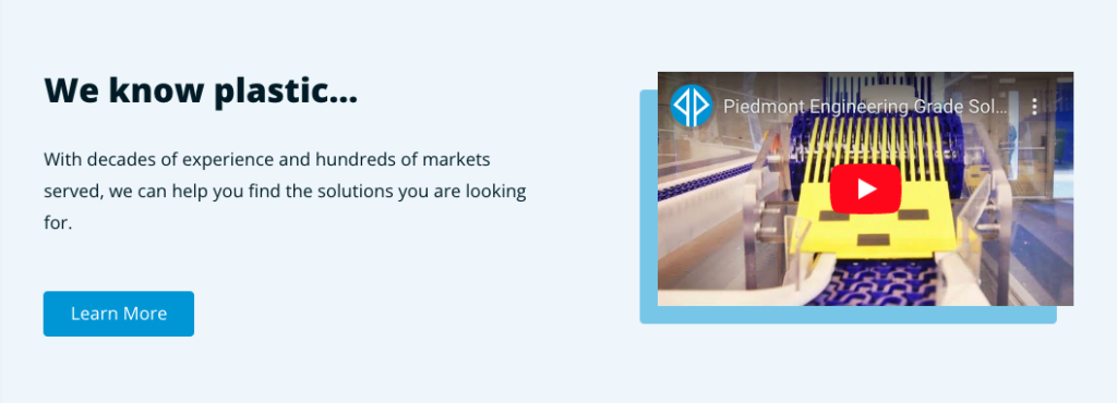
Video - In place of the image a YouTube or Vimeo URL can be added to the video field.
Button - Adding text to Button Label and selecting Show Button Controls gives us the option to link a button to an Entry, URL E-mail, Telephone, SMS, or Asset.
Here are a few more examples of blocks using other configurations.
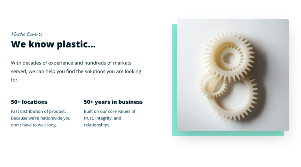
Or we can remove the eyebrow and add a call to action if we wish.
We could also add a background color to our block and instead of adding an image add a YouTube url to the video field.
The Content Plus Media block offers immense flexibility, enabling seamless addition and removal of text blocks and image-to-video swaps, elevating the visual appeal of our web content. Delving into its configuration reveals a host of options, from markdown-driven content structuring to image positioning and background color selection. With thoughtful consideration of each element, we can craft dynamic layouts that captivate and engage users, ensuring an immersive browsing experience.